Diving into the Data Behind The Welikia Map Explorer
Annie Fu is the Geospatial Developer at the New York Botanical Garden.
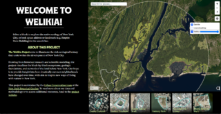
On Earth Day, the Urban Conservation team at the New York Botanical Garden launched the newly redesigned Welikia Map Explorer, a historical ecology mapping tool that reveals what the landscape, plants, animals, and people might have been like on your block in New York City, 400 years ago.
Newly added features include:
- A modernized, mobile-friendly interface
- Expanded coverage across all five boroughs of New York City and beyond (previously only data for Manhattan was included)
- An updated aerial rendering of the landscape circa 1609
- A click-to-view highlight reel for blocks of particular historical and ecological interest
The Welikia Project and its predecessor, the Mannahatta Project, have been more than 25 years in the making. For the new website, creating such a data-rich tool took over a year of effort from the team. From block-level data to imagery to interface design, we brought together a range of technical skillsets, juggled several moving parts, and iterated as a group to realize the new vision for this tool. Below are some key components (and numbers) that comprise the Map Explorer’s vast data ecosystem.
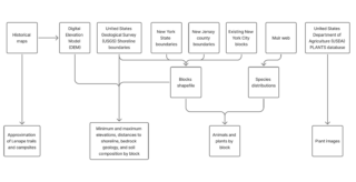
A diagram depicting the many data sources of the Welikia Map Explorer and their data outputs.
The Digital Elevation Model
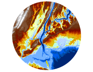
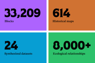
Constructed and refined over two decades, the digital elevation model (DEM) is the foundational data source of The Welikia Project. A digital elevation model is a computer map of the elevation of the Earth surface, including underwater areas in the harbor. To build the DEM, we identified, georeferenced, digitized, and synthesized approximately 614 historical maps, combining them into one single raster dataset. Each map was first georeferenced by hand using GIS software, aligning historical features to modern coordinates. Since the maps often vary in creation technique, date, and purpose, they often contain discrepancies, particularly in surface elevations. The landscape itself also changes over time. As a result, a significant amount of work went into reconciling the many versions of topography for each region. Additionally, since hills direct streams downhill, the topography and hydrology required alignment as well. Over the past four years, this portion of the work was led by Lucinda Royte, our Manager for Data, Tools, and Outreach.
The final product is a topographic model of the ground surface across Welikia, capturing ground texture and elevation but excluding trees, buildings or other aboveground features. Historical sea level is plotted onto the map to define the intertidal zone. Heights above sea level map the topography; depths below sea level map the bathymetry. Using the DEM, any geographic information system, we use ArcGIS Pro, can calculate slope, aspect, flow direction, and more. For any block, we can therefore deduce whether it was underwater or dry, flat or hilly, and begin to infer its likely ecosystems.
The blocks
There are 33,209 clickable, searchable blocks in our map explorer. They come from a custom shapefile built by combining USGS shoreline boundaries, New York State village boundaries, and New Jersey municipal boundaries, and New York City block based on the city’s street centerlines from NYC Open Data, slightly massaged in some instances for clarity. Each block has a unique name and ID, which serve as the key to linking data across many datasets. A class of NYU Environmental Studies students helped us name the blocks several years ago (Thank you!).
When a user clicks a block, the browser registers the block ID and triggers a function that pulls historical information about that location, including its plants, animals, people, and land, from 24 different datasets.
The aerial rendering
Upon first entering the Map Explorer, you’re greeted with a sweeping aerial rendering of Welikia’s historical landscape, spanning approximately 32 kilometers in diameter. The round includes all five boroughs of New York City, along with portions of New Jersey and New York State. Visualization artist Eric Mehl from Hypothetical, Inc., rendered this image, drawing from our team’s digital elevation model, hydrology, shoreline, and consensus vegetation map to represent variations in terrain, vegetation, elevation, and water features.
The plant and animal species lists
To create the lists of plant and animal species by block, we began by compiling historical lists of species for New York City from surveys, herbaria, museum collections, and other sources, as described in Eric Sanderson’s book Mannahatta (Chapter 6 and associated notes). We removed species that have been intentionally or unintentionally introduced to the landscape, and added back any species known to have gone locally extinct over the last 400 years. Species lists cover the plants and vertebrate animals at the species level, and other important species such as fungi and insects are included at the family or order level.
We modeled the distribution of the 1,001 most likely species of plants and animals (including fish, amphibians, reptiles, birds, and mammals) using Muir Webs—our team’s computational network model representing over 8,000 relationships between species, habitats, and abiotic factors like water, sunlight, soil, and air. The Muir Web outputs over 2,500 geographic raster files, each mapping the habitat suitability of a particular species across the entire landscape and the abiotic elements on which those species depend.
To turn those species-level rasters into block-level summaries, we wrote a script to calculate zonal statistics—summary values for each species within each block boundary—revealing which plants and animals were best suited to the ecosystems in a given block. We used a similar method for the elevation data by block: calculating the minimum, maximum, and elevation range within each block using the digital elevation model.
Other block-level data, including types of surficial and bedrock geology and speculative patterns of human activity, were calculated with a mix of GIS tools, databases, and Excel spreadsheets. The bulk of the distance-based analyses involved calculating the center point (centroid) of each block, then measuring its distance to various features within geospatial datasets and archaeological records. We also ran multilayer analyses of bedrock and soil composition at the block level, producing percentage breakdowns for different soil and rock types. Together, these insights allowed us to reconstruct both the physical makeup of the land and how it may have supported human activity and survival.
The interface
The original Map Explorer launched in 2010, in a bygone age of the internet with different design standards, tools, and technical limitations. We knew a modern relaunch would call for a complete overhaul of both the user experience (UX) and user interface (UI). After our painstaking work of incorporating so much new data, we needed to ensure the tool would be intuitive, accessible, and fun to use.
We began our design process by conducting user interviews with a variety of different people who use our tools, including high school and college students, teachers, plant scientists, journalists, and generally curious adults. We then transcribed and synthesized these conversations into actionable design improvements, which guided the creation of 23 mockups and an interactive prototype. These mockups anchored our design conversations, helping us compare ideas and balance needs for accessibility, cross-device flexibility, and intellectual depth.
With our interface redesigned and all the data linked together with Javascript, the new Welikia Map Explorer was ready to go live at Welikia.org!
What’s next for The Welikia Project?
Although we’ve just released our Map Explorer version 2.0, our work is not finished yet! Over the next few months, our team is continuing to roll out improvements and updates to the website, with a major update forthcoming at the end of summer (version 2.1). To stay in the loop about our team’s work, sign up for the Urban Conservation monthly newsletter.
Over the coming months, we have plans to launch other websites as well, including “Layers of the Past” (working title), a tool for visualizing and providing access to more than 600 georeferenced historical maps for New York City, as well as a relaunch of Visionmaker, our ecological democracy tool for crowd-sourcing ecological visions of the future of the New York.
Have feedback or suggestions for improving Welikia.org? Thoughts on any of our other websites and work? Our team would love to hear from you. Write to us at urbanconservation@nybg.org.
We appreciate generous financial support from the National Oceanic and Atmospheric Administration (NOAA) and the Office of United States Senator Charles Schumer.
SUBSCRIBE
Enter your email address to subscribe to this blog and receive updates on new posts.
Follow @NYBG


